Elevator in everyday life, in order to help people to save time, is characterized by large traffic, high frequency of usage and pay attention to efficiency, using unconventional formative elevator buttons, common elevator button on the control box of the basic rules are a whole transverse longitudinal alignment layout.
Button material
Elevator buttons can be in the form of floor numbers and buttons integrated and separated, in this case, only floor Numbers and buttons integrated. The common materials of buttons are white characters of silver background, black characters of silver background, black characters of white background and white characters with black background.
Analysis on the recognition: white background black characters, black background white characters and silver background black characters, text and background can form a large contrast, easy to identify. The white letters on the silver bottom are relatively low in recognition and difficult to read when not facing. It’s all silver, and there’s a similar problem.
Design 1- Braille button for special people
Now many public facilities and housing are designed for the special groups, which is a country, a city, the embodiment of the humanistic care to special groups, designed for the special groups, should be first defined as under the premise that does not affect ordinary people use can ensure that the special groups, and it’s convenient to make such as brailed buttons.
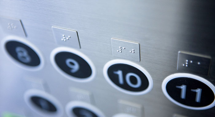
Button design for the blind, which is supposed to be the most popular design for the special population, and the form is quite colorful.
The most common way is to put Numbers and braille tags together on the same button, like S. It should also be the cheapest way to achieve this. But personally think that the problem is the border of the touch and press hard to grasp, do not understand the blind mode of operation, oneself just wants to feel there is the problem, if there is any misunderstanding at correct). Imagine a blind person touching a button area and trying to figure out how to make sure the Numbers look for patterns. Knowing the braille should be touched with some force, but avoid pushing the button. Whether it is easy to operate by mistake like this, it is easy about the blind to be in a more nervous state.
U and c are barely a type of design. The black area places the floor number and braille mark, and the button provides the operation. Such separation processing avoids the above mentioned problems. However, the comparison between the two also reveals a problem that U fail to consider the principle of intimacy. If you look at the layout of U, it is probably the work of an industrial designer who is too dedicated to “alignment”. Configuration is very uniform, but black area and button corresponding relationship, can’t be clear at a glance to see or find out, we should use “read from left to right” experience or a minimum repeat unit to the right operation. The design like c USES exterior matching to form a natural connection between the two, which is a relatively good design.
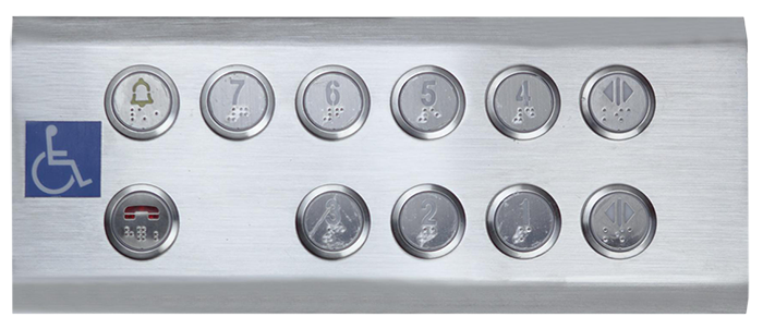
X’s design is more neutral, which ensures that blind people can recognize it, and also ensures that it does not increase the burden of recognition on ordinary people. It is also very beautiful. J and T is a person feel better design, made braille region and the entire panel the same raw material, and its corresponding floor button closely arranged, neither too much interference identification, ordinary people also convenient operation for the blind. However, T is slightly superior to J in the design of braille area. Braille is arranged on the same board for convenient extension and touch.
Design 2 – disabled operation panel for special people
In addition to the blind, some elevators also consider the disabled. Ordinary button near the door on the right side of the central commonly, it is still partial corner space position, for the disabled, don’t use tools, regardless of whether they are accurate to the corner of the position or the upper button operation, is very difficult. Nowadays, many public facilities are located in the center of the left and right sides of the elevator, with separate button panels for the operation of disabled people, which facilitates the travel of disabled people.
The COP humanized button design in the elevator car makes our trip more convenient and warm today!